Wednesday 30 November 2011

Fine Art, or Craft?

We were asked to provide definitions and examples of both Fine Art and Craft and to identify the differences between the two. 
Fine Art
Noun:      Creative art, esp. visual art, whose products are to be appreciated primarily or solely    
                 for their imaginative, aesthetic or intellectual content.
Craft
Noun:      An activity involving skill, making things by hand.


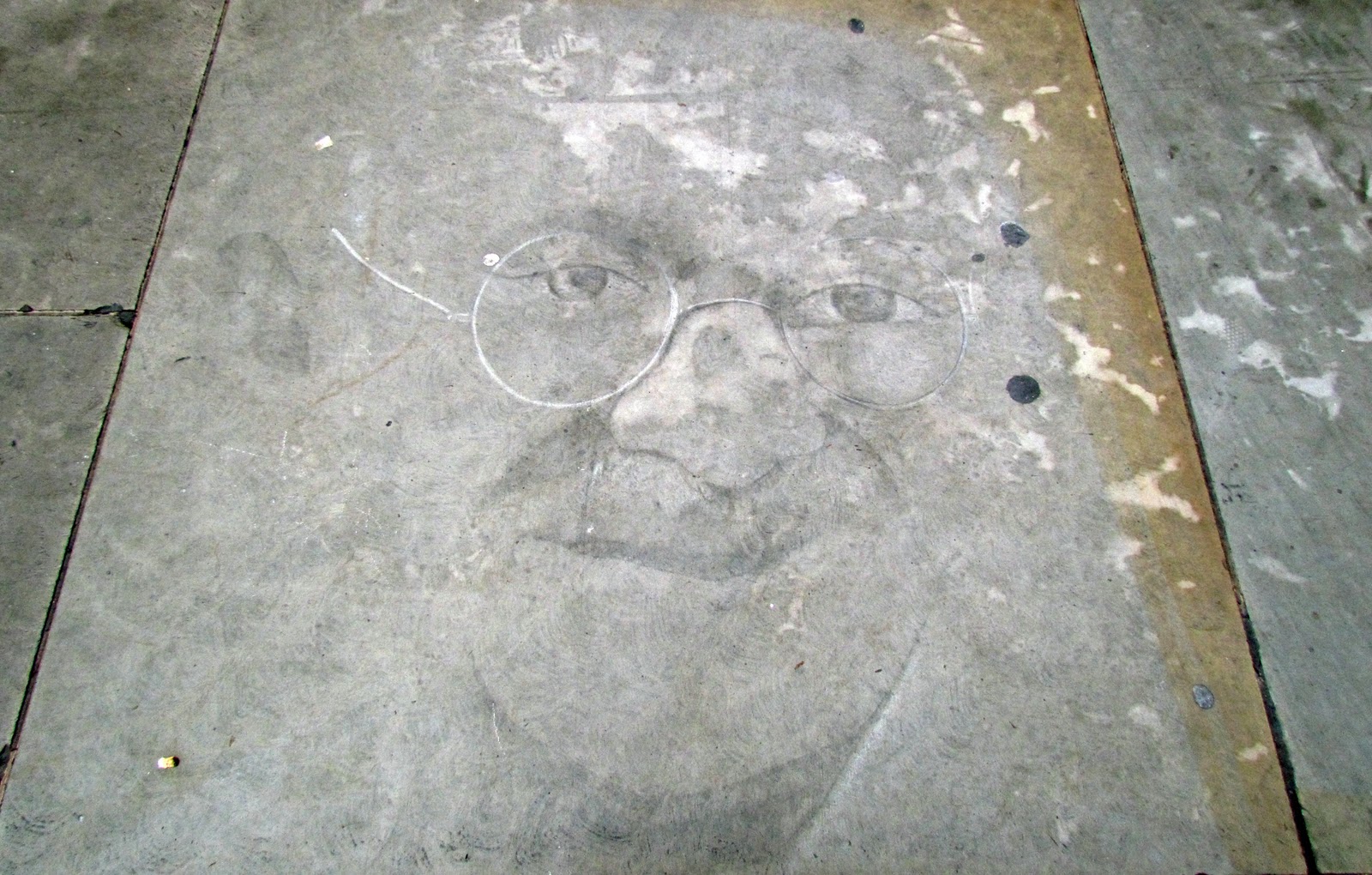
I think the difference between these two images is that the first has been taken purely to be looked at rather than for any other purpose, i.e an advertisement and that the second image is of two felt broaches which have been made for a purpose, to be worn. To me this makes them craft rather than fine art.

Sean Scully- Colour


Colour work isn't something that I usually find attractive but one of the tasks in theory was to find an artist who works with it, so I kind of had no choice but to go trawling the internet in search of something I liked. I came across Sean Scully and his work and I have to admit that I do actually quite enjoy it. I think what I find attractive about these pieces is how the colours harmonize and the fact that they are all different tones and shades of eachother. The way the colour blocks have been arranged is another thing that i find attractive, they seem structured and you can tell each one has been intentionally placed to compliment those around it. I prefer this approach to some of the pieces of work I've seen where the colours don't look as though they belong together, as though someone has just plonked random colours on a page and called it art. I have been told that the positioning and placement of the colours is very important and well thought out in these pieces and that apparently it's harder to do than you think, I'm yet to be convinced.

Monday 28 November 2011

Protection Project - Photographs

Some of the photos I have taken as part of the protection project, to draw from and also to use as sources of inspiration.


Leeds Armouries

As a starting point for our most recent project, titled Protection, we were taken to the Royal Armouries at Leeds for research purposes and for inspiration. 


Sunday 20 November 2011

Christmas Craft Fair

Recently, I've heard so many people saying how once they've seen the Coca-Cola advert on television they know Christmas is on its way, but for me it's something slightly different that gets me feeling all christmasy. The craft fair in Birmingham. I've visited every year with my two aunties since I was nine, it's become something of a tradition now. This is my favorite picture I took that day as I think it's quite nice to see a decoration that isn't the traditional green and red, I love the warm earthy tones and how the garland was made entirely from natural materials. I'm definitely going to give this idea a go!

Wednesday 16 November 2011

Wearing the 2D piece

Part of the fashion and textiles project was to use found materials (i.e. cardboard boxes and papers) to create a 2D piece which could then be worn. The colour scheme we decided to use was influenced by 'Are Mine' by Joan Synder with the addition of a third colour- green. Using our initial sketches of drawings done out on location meant that we had a starting point and could use the shapes, patterns, and textures in this bigger 2D form. We had to wear the piece in several different ways, I really do think it's worked well, infact much better than I expected! The only thing I would perhaps change if I was to do this project again would be to try and concentrate on creating a flat structure first rather than constantly trying to visualize what it would look like on the body as this made the task more complicated than it needed to be!


Colour/Material Samples


Final colour and material samples for project.

Colour Research - Joan Snyder

Are Mine- Joan Snyder
Original colour inspiration for the fashion and textiles project.

Fine Art

While working with the shirts and discovering less conventional ways to wear them I started thinking about the type of people that would wear a shirt day in day out and how repetitive it would be wearing this kind of uniform. I decided to make small origami shirts using photocopies of the original garment with the colours altered. The very nature of folding the paper over and over again soon became quite repetitive and I think this mirrored my thoughts on wearing the same uniform every day. One feature of the shirts that I really like is how the buttons and seams on the photocopies have ended up in unusual places on the small shirts and also how the stripes are so disjointed. If i was to do this again I would probably take more time when cutting out the paper pieces and try to select the areas more carefully to create more interesting patterns.

Sunday 6 November 2011

My Life in Four Objects- Object Four

Object Four- Present
I decided to make my driving test pass certificate my final object because it is something I've been trying to get for so long! I think in the end I'd had hundreds of hours of driving lessons and five tests before I finally passed! I would like to be able to say that this certificate says a lot about me- probably that I don't give up or how determined I am to achieve- but it doesn't say any of those things. All it probably says is that I was bullied into taking test after test after test by my parents until I eventually got it right and passed on the 28th October 2011. Having said all that though I have enjoyed driving since then so it's not all bad and I should probably be thankful that they made me carry on!

Research- Junya Watanabe

I think it is the headwear in this collection that I find most interesting as it really does challenge our ideas of beauty. I usually see the face as the most beautiful part of the human body, however, here it is completely covered by something that I consider to be quite an ugly structure. 

Research- Issey Miyake

 Issey Miyake- Minaret Dress
Issey Miyake- Minaret Dress

 I love how structural this dress looks and the way the rings in the dress get bigger towards the bottom- it really does move away from the traditional 'hour glass' figure which is usually what people are wanting to create in their clothing. I also find the way that the dress can be folded up very attractive as it transforms it from a garment to something that could perhaps be used as a decorative 3D piece or a wall hanging etc.

Fine Art- Day One

For the fine art taster week we were working with the idea of clothing, identity and creativity.  Looking at radical fashion designers and artists who work more conceptually helped in understanding the brief and the way we inhabit our clothes, the shapes and spaces we can make with them and our pre-conceived ideas of beauty.
Wearing shirts in less conventional ways.

Using a shirt to create a 3D form.
Protecting an object and a space in the room with shirts.
After taking the shirt to pieces and using the components to create something new to wear/use as a wall hanging.

Kensington Palace- The Enchanted Palace


I visited Kensington Palace last week while away in London, I'd read about The Enchanted Palace exhibition which was being put on while they were renovating some of the areas. After reading the information and the reviews I had pretty high hopes for the exhibition. I wasn't let down, it was incredible! I literally felt as though I had landed in the middle of a fairytale. Seven of the rooms in the state apartments had been transformed into almost magical areas for seven princesses (Mary, Anne, Caroline, Charlotte, Victoria, Margaret and Dianna) each of which told a story. There were dresses by designers such as Vivienne Westwood and Boudicca while Jane Darke's collection of sea-borne objects were on display as well.
Link to the Enchanted Palace

London Visit


Stayed in London last week- these are some of the photos.

Wednesday 2 November 2011

My Life in Four Objects- Object Three

Object Three- Early Teens
I wanted to put a photo of my horse in here as he was a pretty big part of my early teenage life (to be honest he's still a huge part of my life today) but I've already included  a photo so thought I'd go for something a little less obvious. I'd been riding four years when I was finally allowed my own horse, it was something I'd pestered and pestered my parents about for ever! I'd even spent hours sat on my gate on a tea towel pretending it was a pony to try and convince them to get one. Eventually they gave in and we bought Luke! I was 11. This is the first ever rosette we won together. It was at in the Junior Handler class at Wingerworth show. I should have been really proud of myself for getting a 2nd in my second ever show, but I wasn't. I wanted to get 6th because that rosette was purple and it was my favorite colour! Looking back now though this rosette does mean a lot.

Stephen Fry, Kinetic Typography on Language

I came across this video a while ago and remembered it when we were looking at typography during the Illustration and Graphics project. It ties two of my interests together- art and language!

Illustration- Post Cards


We were given a word as a starting point for this project and had to make post cards using the word as the theme. I worked with 'stormy' and made these cards. I used old stationary paper, magazines and news papers as the grounds for my cards and then worked on top of them. I think the first three cards work effectively but I don't like the last one with the thunder and lightening as I think it's too obvious and literal. My favorite card is the storm in a teacup as I really like the way the pages of the book work as a background and also how I have drawn over the collage material.

Illustration Research- Oliver Jeffers

One of the illustrators/graphic designers that I researched during this project was Oliver Jeffers. This is probably one of my favorite drawings by him, I think what I find most attractive about this particular picture is how simple yet effective the background is and how the subtle blue colours push the red of the umbrella and the little boy's outfit forward. It's just the perfect image for a children's book!

Illustration

Examples of work in my sketchbook using collage to create unusual scale.

My Life in Four Objects- Object Two

Object Two- Late Childhood
The photograph is of my brother and I and was taken eight years ago when I was ten and my brother was six. We were in Cornwall on a family holiday and went to a small town called Lynton and Lynmouth. My Nana and Grandad asked if we wanted to have a special photo taken where we got to dress up. I remember how the the velvet bodice and the silk of the skirt felt, but most of all I remember how heavy the dress was. This photograph and the memories that go with it are very special to me because they're from a time when my Grandad was healthy and he was the one looking after us, rather than it being the other way round. Even though he is unwell now and remembers very little he still likes looking at this photograph. I'm not sure if he knows who the people in the picture are but as long as he's getting some sort of enjoyment from looking at it then that's all that matters to me.